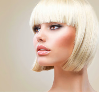
INTRODUCTION
This is a look that I have been using in one way or another for a number of years. I have noticed that it's becoming more popular lately on webpages and movie posters. I decided to write it up into a tutorial for your enjoyment!The Trendy Colorizing Effect :
Step 1
This is an effect that I have seen used in different ways. It seems to have evolved into a low contrast version, which I have seen on movie posters etc. So I figured, why not make a tutorial on it and show you my way of making this effect. I don't really have a name for it, so I heareby dub it the: Low Contrast Fashion Color effect.
Step 2
First of all, for better results, reduce the contrast. The best way is to use an adjustment layer. Create a levels adjustment. (You could use Levels Cmd/Ctrl+L if you prefer)In levels, Push the midrange to the left, by moving the middle gray triangle.
Step 3
Add a gradient fill adjustment layer. This is available as an adjustment Layer. Choose the Gradient Fill option.Choose the rainbow colored gradient option by clicking on the gradient preview and choosing it from the gradients that appear.


