|
INTRODUCTION :
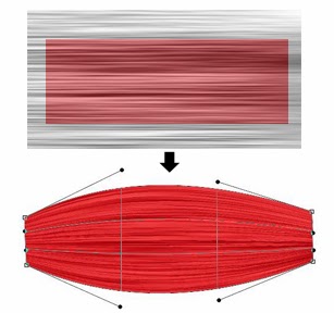
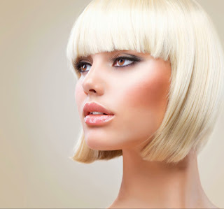
Photoshop basics. Making selections with the marquee tools. Adding and subtracting selectionIs it possible to make a selection of this semi-complex shape in only 3 selections? Of course the answer is yes.
Ok if you’ve given up, or want to check your answer, here’s how its done.
Adding and subtracting from selections
Is it possible to make a selection of this semi-complex shape in only 3 selections? Of course the answer is yes.
Ok if you’ve given up, or want to check your answer, here’s how its done.
Step 1
Using the elliptical marquee tool make a selection around the
outside circle. If you hold down the spacebar as you create the
selection, you move the entire selection. Release the spacebar but not
the mouse to continue drawing the selection.
Release the mouse. You will now see the marching ants as you have selected the outside circle. 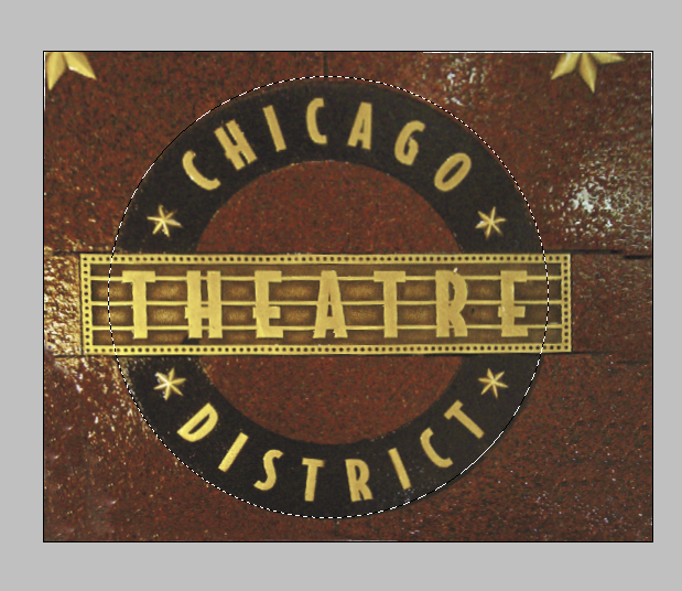
Step 2
Let’s cut a circular selection out of the center to select just the ring.
With the elliptical marquee tool still selected, hold down Alt
(Option). You will see a little minus sign by your cursor. You are about
to subtract from your selected oval. Drag in the middle until you
selected the inside circle.
Release the mouse and now you have selected the ring. Congratulations, you just created a complex selection. 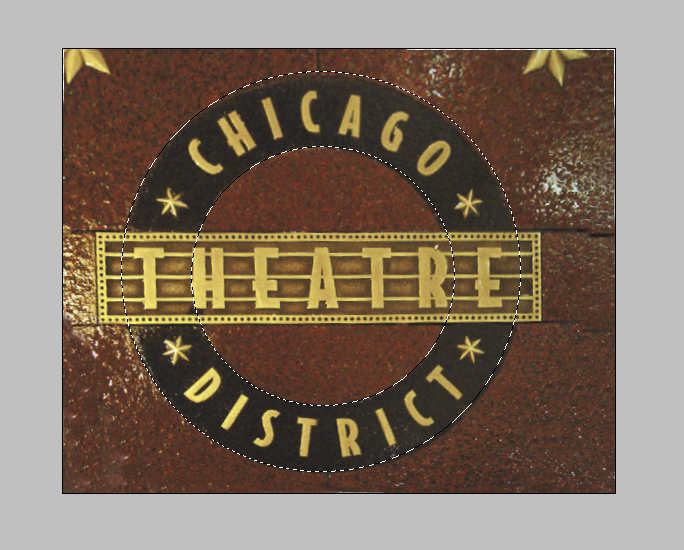
Step 3
What about the rectangular shape? Do you think that we should
subtract or add a selection here? You got it, we need to add some pixels
to our selection.
Choose the rectangular marquee tool.
Hold down the shift key. You will now see a plus sign by your cursor. This means that you will add to the selection
Drag the cursor over the rectangular area.
Release the mouse. You now have selected the shape using a
combination of tools. You have also used the add, and subtract from
selection options. Powerful allies when making selections.
Step 4
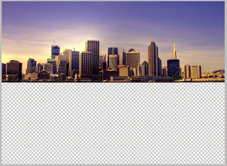
Ok what are you going to do with this selection? The most
common reason people will select is to remove the background. Here is
the best and easiest way of doing just that.
With your shape still selected. (If you accidentally turned off the selection, choose Select>reselect.)
Choose the move tool. (V key)
Press Ctrl-J(c-J) to copy the selection to a new layer.
Click the eye icon in the layers palette next to Background
The background is now hidden and you see the checkerboard
pattern. This lets you know that the shape is now floating on a
transparent background. You can add this to a collage, save it for a
publication, export it as a transparent image for the web or what ever
you want to do with it.
xtra credit
The different options from the options bar to make complex selections with the marquee and lasso tools.
Add to selection: Combines the selection together
Subtract from selection: Removes the shape from the existing selection
Intersect selection: Only the overlapping area will be selected
As you just saw, you can combine different tools to make complex
selections. As you become more comfortable with Photoshop, try to use
the different tools to make your life easier. Because there are so many
tools in Photoshop, it may take a bit of practice to know when to use
each tool. This book will help guide you in that direction.
As I struggled to think of a design for the contest, I took some
time to clear my head by watching some TV. It turns out that The Matrix
was on, and was right at the scene in the subway as they used the pay
phone to escape. And an idea was formed. Why not make a phone, a phone?
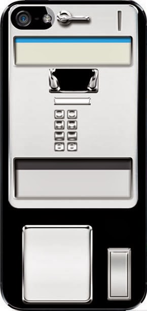
Step 1
I started out with the supplied template and began to
slowly build my phone using mostly shape tools and layer styles. All of
this was created using Photoshop CS4 and a Wacom Intuos3. No external
images or programs were used.
I laid out a few rounded rectangles and used a chrome
layer style as a starting point for to get the raised metal look and
would adjust each slightly to create the exact look I wanted.
Again, using more shape tools (circle, rectangle, rounded rectangle)  
Step 2
I created the coin slot and coin return lever adding an
inner shadow to the coin slot, and adjusting the chrome layer style for
the lever and the same for the phone cradle and buttons. I decided not
to do all of the buttons just yet because I knew the handset would be
covering a majority of them. As I look back, the one thing that bothered
me is that I took the first column of buttons and just duplicated them
without changing them at all. Even though you can’t see it in the final
product, I know it’s there. Since the time that I submitted it, my
slight OCD kicked in and I altered them so they weren’t an exact copy.
 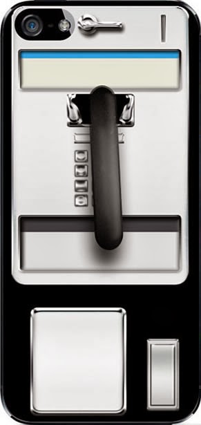
Step 3
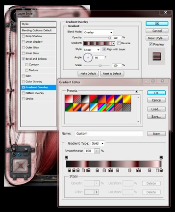
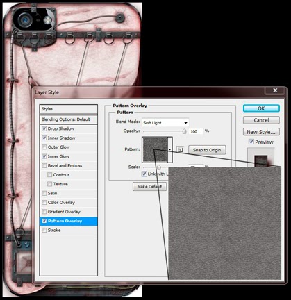
To create the handset I began with a rounded rectangle
with a large curve, adding a drop shadow, bevel/emboss, gradient and
pattern overlays and stroke to get the effect of the phone hanging off
of the cradle. The pattern overlay was used to add a bit of texture as
if it had been used for quite a while. I then added two circle shapes
and finished them off using a similar layer style to the handle, while
also using the burn and dodge tools to add some additional shadow and
highlights.
Since the handset is above a reflective surface, I made
sure to duplicate and transform it and added a slight blur and masked it
out to fade the reflection.
Step 4
I then moved onto what I thought was going to be the tough
part of the phone, finding a way to make the cord look like braided
metal. I spent some time trying different tools to get the look I
wanted, the best result came from using the pen tool to create a path
where I wanted the cord to fall. From there, I used the concentric
circle brush with the spacing set to around 20%, and the shape dynamics
set to a 0 Size Jitter, and 100% Maximum Diameter with all other options
off to stroke the path.
Step 5
The actual cord is made up of 6 layers set to overlay,
and screen with inner shadows to help finish off the effect. Again, with
the cord on a reflective surface, don’t forget to add the slight
reflection with the opacity turned down to 50% and set to Hard Light.
The blue rubber was then added to connect it to the phone using shapes
and the burn/dodge tool to give it a rounded grungy look.
At this point the phone was ready for the text to go on. I
took a look at a few phones to see what information was included to be
sure I had an accurate look. With the blocks of text below the buttons, I
used a Lorem Ipsum filler text because I knew that the text would not
be readable at the size it was set at, though as with the buttons, I’ve
since gone back and added text that would be included because it didn’t
feel right having “filler text” on it. As an added touch, I added a US
map that I found on Adobe Exchange, and added the Adobe logo.
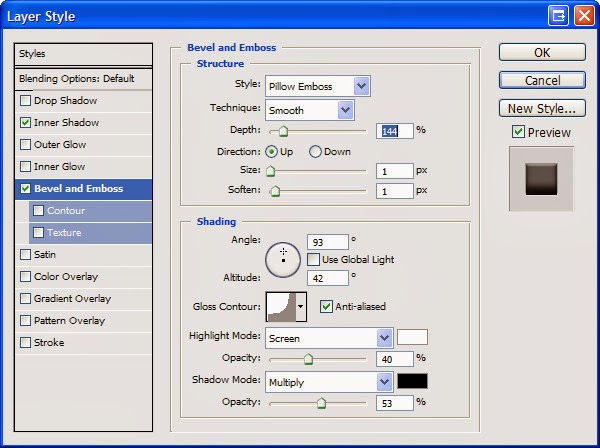
For the embossed text on the metal areas, a slight inner shadow, and pillow emboss with a depth of 144 was used.
Step 4
I then went through and added a few minor
touches including a couple of advertisement “stickers”, the lock box key
slot and outlines around the information text.
I was happy with it at this point, but felt it was a bit
too clean looking and needed some grime as if it had been used for
years. I took a cloud brush with a brownish color and set it to a Size
Jitter of 100%, Angle Jitter of 100%, and Scattering to 300% all with
Pen Pressure set as the control. I then began to randomly brush over
the entire phone and lowered the opacity and added a layer mask to
soften areas to a point where I felt it was just enough.
As with most designs, I had a lot of trial and error to get
to the final product; trying out various brushes, effects, shapes,
colors, fonts, etc., and of course there are a dozen different ways to
get the same effect, so go with what works for you. Personally, I am
happy with the result and glad to find my first second place win!
Developing the illustration for the iPhone “skin” did not start as a
completely preconceived idea. In this case, I began with the camera. I
felt in needed to be fully integrated regardless of my uncertainty of
the final concept. I did not like the idea of it “floating” in my
illustration. And by doing so the rest of the concept was revealed.
Sometimes it is good just to jump in even with just a partial concept,
because as I get busy, the creative process will certainly be
stimulated, and ideas begin to evolve
Step 1
I first used the rounded rectangle tool to
pull out a basic square around the camera, and then reshaped it a bit so
as not to be so square. I decided I liked the idea of metal; but
because the iPhone has such a high gloss aesthetic, I thought a worn
metal would make a nice contrast.
I filled the shape with a bluish gray color
to create the basic plate. Then I made a selection of the camera and
deleted that space from the fill, to allow the layer style to be
apparent on all edges. Next I added an inner bevel with a chisel hard
edge, and a pattern overlay with a mottled pattern to age it some.
Painting on a layer mask let me chip away at the edges for an even less
refined appearance. Now that the camera was encased it still seemed
detached, so I created the binding clips and cross bar (using the same
layer style) and a simple small brush with a basic bevel for the rivets.
For a little more detail and interest, I then created the rings. This
is just a path created with the ellipse tool that I then stroked with a
hard edged small brush using the same color as the metal plate. I added
the same layer style with the exception of the bevel, changing the
contour to “Ring” (hmm, seems appropriate now), and a drop shadow.
Step 2
The ring clips were created the same way as the others,
but adding a second layer for the ring housing to pass through with a
simple rectangle and a gradient overlay (black to gray to black) to
create dimension. Once one ring and clip were complete, I grouped those
layers and then duplicated the group several times and moved them into
place. It was at this point the creative synapses really started firing,
as I thought something needed to be attached to the rings and the whole
metal camera casing needed to be embedded into something. Aha - It’s
Flesh! But I wanted it be a little horrifically experimental and
fetishy.
So here I filled the base shape with a grayish pink to give
an unhealthy hue. With this skin theme established, I needed to go back
to my metal camera contraption, and added outer glows with various pinks
and reds with some noise to imply some inflammation and infection. I
therefore changed the shadows to a deep dark red with lowered opacity
and bright white highlights of the metal to a dingy pink to give some
sense of radiosity.
Next I turned my focus to the general skin
aspect. After filling the skin layer with my chosen base color and added
a Pattern Overlay (basically Render>Clouds, scaled up and set to
Overlay in the blending mode) to continue that unhealthy look, I used
Transform>Warp and pulled the lower right corner up toward the left
corner. But before doing this, I created a blank layer below and merged
down, which would preserve the mottled pattern so that when I warped the
layer, it would actually stretch that pattern for a better sense of
realism. Though I would not use this warp specifically, it provided a
template for me to create the pulled skin flap Now I could use the pen
tool to trace the basic shape of the skin flap that I could then
duplicate to its own layer to keep that stretched appearance, adding the
pulled points where it would attach to the rings.
Step 3
Creating a new layer, I filled the new path
with a darker pink for the underside of the skin. Now for the details.
I added a mottled pattern overlay set to a soft light blending mode and
reduced opacity to give an uneven blood distribution effect. On a new
layer, I made a loose random selection with the lasso tool and ran an
old Alien Skin plugin filter (Xenofex 2>Electrify) to generate random
branched “veins.” From here, I individually selected specific veins and
placed each on its own new layer, moved each into place on the skin
flap and transformed it to fit. Next I added a layer style, namely a
soft bevel and light drop shadow. To further enhance the effect, I
dropped the fill on each one, preserving the layer style but reducing
its opacity, giving it a translucent look. Adding a layer mask, I
cleaned up where the veins met the edges of the skin, but also used a
soft edged brush with a reduced opacity of black to lightly fade the
ends of the veins to appear like they were fading into the skin. To
create the folded over aspects of the skin flap, I used the lasso tool
to make quick loose selections (subtracting an inverse selection of the
original skin flap to keep the edges aligned), and on new layers filled
those areas with the exterior skin color, adding a layer style of a soft
bevel and drop shadow. To give some more dimension, particularly the
pulling effect, I essentially used a dodge and burn effect, but rather
than using those tools on the skin layer directly, I added a new layer
above it, changed the blending mode to soft light (I find this tends to
work better for skin than overlay), and painted with black & white
with a soft edged brush with low opacity and pen pressure override set
for both size and transfer. This allows me to build up the effect as
needed.
Here I turned back to the exterior skin. I
wanted to carry the biomechanical aspects further, and so created the
plate in the lower left corner using the same layer styles as the camera
housing. So as not to recreate the exact same thing, however, I
included what amounts to something like a “bio-port” that would be
protected by a glass cover. I created the “bio-port” scar with a small
brush using a dark pink color (again with pressure sensitivity overrides
set), a layer style of bevel & emboss and inner shadow, and using
small stippled strokes built up the wound until I reached the desired
look. The glass cover is a simple square filled with light gray with a
bevel & emboss, inner shadow, and drop shadow layer style, and then
reducing the layer fill to around 10%. I added an additional highlight
by painting a right angle with white, running a slight Gaussian blur and
dropping the opacity.
For some continuity, and to keep the eye
moving around the illustration, I added the cord between the two metal
encasements. Because straight is boring, I created a bent line path with
the pen tool. I also figured I could add some more horrific detail by
attaching it to the flesh as well. I simply stroked this line with a
hard edged brush with a dark gray. Again I used the bevel and emboss
with the “Ring” contour that I had employed for the small rings,
adjusting the settings as needed for the thicker line. I needed the cord
to look like it was wavering over the skin, and thus needed some
additional shadows and highlights, but rather than using the dodge and
burn effect I described above (which would have worked) I decided I
would use the gradient overlay in the layer style where I could add
blacks, whites, and grays in the appropriate areas to give that
dimensionality I was after. This was better too because it also let me
add some red, suggesting some old blood and a little radiosity again. I
could have painted this as well, but it’s nice to have a layer style I
can quickly go back in and adjust if needed without creating new layers
and repainting.
Step 4
I created the segmented look by adding a new layer above
the current layer with the cord, using a small hard edged brush with
the same dark gray and a tight bevel & emboss and drop shadow, and
made quick horizontal strokes up the length of the cord. To keep from
getting outside the bounds of the cord, I made a selection of the cord
first (Ctrl clicking the layer thumbnail of the cord). Next I painted 3
simple arcs for the stitches pinning the cord to the skin, using the
same layer style as the rings.
So the cord needed a shadow too, but one
that made sense, because a simple drop shadow was not going to work
here. To achieve this, I stroked the same path again with black on a new
layer, moved that layer beneath the cord layer, and flipped it
horizontally, and then distorted it so the pinned-down points were
aligned. I ran a Gaussian blur and reduced the opacity of the layer. But
that still was not enough, because shadows change density based on
their proximity to the object casting it. So once again I added a layer
mask, and using a soft edged brush with reduced opacity black, and
pressure sensitivity constraints set, painted away the areas where the
cord appeared to lift furthest from the skin, softening that shadow. I
used this same technique on the wire at the top of the illustration.
I focused next on attaching the skin flap
to the rings. This was rather quick and easy. I duplicated one of the
rings from the metal plate, and simply transformed each one by rotating
and scaling each where I aligned it to the holes in the skin. A quick
mask and they appeared to pass right through. As for the rings on the
crossbars, again I applied a Transform (scale and distort) to create the
look of pulling and tension. I followed that with some straight lines
(necessary here) and adjusted the bevel and drop shadow accordingly.
Now I could move deeper into the interior. I wavered between
viscera and muscle, ultimately going with muscles as it was the correct
next layer anatomically (as well as having a good idea to create them).
Here I added a new layer, created a rectangle with the Rectangle
Marquee tool and filled it with a deep red. Now I needed some
striations, so I created a larger rectangle with the Marquee tool again
on new layer above the layer containing the red rectangle, and filled it
with 50% gray. I set my foreground and background colors to default
black and white and then ran the Render>Fibers filter (not a lot of
variation but fairly high strength), followed by a motion blur in the
same direction as the fibers to smooth them out a bit. I changed the
layer blend mode to Soft Light. Making sure the fibers are running
longitudinally correct with the length of the muscle, I next scaled the
fibers layer to compress the fibers into a tighter space, but making
sure to keep it larger than the red rectangle. I made a selection of the
red rectangle, and still on the fibers layer, duplicated the layer
(Ctrl+J) using that selection; then combined this new fibers layer with
the red rectangle layer into one layer. Now I used Transform>Warp and
pulled the ends in and middle out to create the fusiform shape of the
muscle.
Step 5
To create dimension, I added a layer style using a
gradient overlay and inner shadow. I moved this new muscle below the
skin flap layer and rotated it into place. I duplicated the muscle
layer, moved it below the first muscle and transformed its position a
little. I added a drop shadow to the first muscle to create some depth. I
duplicated the muscle layer 2 more times and moved the below the
previous one and rotated them into place, further creating depth.
Keeping with the flow and continuity of the
image, I again created the 2 bio-cords beneath the skin similar to the
one on the exterior. To keep in interesting, I thought an intravenous
injection would be a nice addition. The cords were created the same way
as described above, and using the Pen tool created the line that would
be the thin blue wire wrapped around the cord. I stroked the path with a
bright blue and added another layer style similar to the cords, and
then added a layer mask to remove the areas that incorrectly crossed
over the cord, to make it look like it was snaking around it. I made the
needle heads more polished looking to suggest some sterility, as well
as present some contrast to the more worn aspects of the exterior. And
to create the sub-fascia insertions, I simply made a selection of the
needle, expanded the selection by a few pixels, feathered that selection
by a couple of pixels and, going back to the muscle layer, duplicated
that selection of the muscle to its own layer, followed the addition of a
soft bevel and drop shadow. I added a layer mask and pulled a black to
white gradient up the direction of the needle to soften the tip. Next I
used a small soft edged brush with my foreground color set to white,
lowered the opacity to around 15%, and using the sensitivity
constraints, made quick light strokes to create the connective tissue
seen attaching the skin flap to the muscle and at the needle insertion
sites.
Getting close to the end, but still
unfinished, I felt I needed some internal structure as a frame for the
phone and to which the skin may have been attached. Using the same
techniques as the exterior metal pieces I created the scaffolding at the
edges. Sticking with the idea of keeping the eye continuously flowing
around the illustration, I created the fluid-filled vessel and piping.
It also seemed to add a little mystery. And for just a little more
nuanced detail, I added the little piece of flesh bound to the framework
by a small rivet, implying previous
For final touches, I just needed some
integral scattered details. First , I added the adipose by creating a
couple of layers, painting on each one with a small, low opacity spatter
brush with a light yellow, and added a layer style of bevel &
emboss with a texture to provide a slightly lumpy appearance and a drop
shadow. I painted with small erratic strokes, building up the look. I
added the same adipose in crevices of the metal and wires to help them
feel more grounded in the composition. I used a similar effect for the
blood, using the spatter brush, in some cases painting in strokes for a
smeared look and quick clicks (with the mouse no less – the one time I
deviated from my Wacom tablet) for a more precise droplet effect. Still
using the spatter brush (set to a larger diameter and low opacity) I
softly painted bruised and irritated areas on the skin exterior. Adding
scars help suggest the horrific experimental aspect. They are a series
of irregular painted strokes using a light pink sampled from the base
skin color; a layer effect with soft bevel and emboss and a low opacity
outer glow of red with some noise, again to achieve a look of
inflammation. And yet the exterior skin seemed a little too smooth and
“flat.” What I realized I needed was a subtle skin texture, using a
combination of Filters, defining it as a pattern, and using it as a
Pattern Overlay set to Soft Light blending mode.
Step 6
I often feel I could tweak an illustration endlessly, but
realize at some point, I must put the [Wacom] pen down, and realize the
composition is complete. Such was the case here… not to mention the
deadline was near.
HDR - High Dynamic Range Photography.
Merging HDR in Photoshop Tutorial
This tutorial will explain one of the
hottest new trends in Photography. HDR! Learn how to shoot, merge and
tone-map photos to extend the dynamic range and produce those painted
looking results. Covers photoshop CS3-CS6
INGREDIENTS
--------------------------------------------------------------------------------------------------------------------------------------
INTRODUCTION
I originally wrote this tutorial for Photoshop CS3, in the years
since then, Photoshop has gotten a couple of big upgrades in the HDR
area, and we are now at Photoshop CS6. I have also learned a great deal
more about the subject, so I decided it was time for an update.
What is HDR and why do we need it?
I n this tutorial we will take a look at HDR photography. HDRI
(High Dynamic Range Imaging) was originally used in 3D and is now in
full force in photography. Basically it's the process of taking multiple
exposures and merging them together into a single 32 bit image. Let me
explain:
A camera is capable of capturing a limited amount of tones in a
single photo (we call this dynamic Range, the range of tones that can
hold detail between pure black and pure white). Typically we sacrifice
elements in a photo when we set the cameras exposure. We meter for the
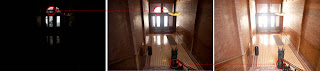
most important part of the scene. For example let's look at the series
of images I shot at the Bradburry building in Los Angeles. The center
image is a typical exposure, showing an average metering to produce the
most detail possible. Notice that the detail outside the door is lost
because it's too bright. Also the detail on the stair rail is lost
because it's too dark. When you are at the location, you are able to see
all these detail with your eye, this is because the human eye can see a
larger range of tones than the camera can capture on the sensor or film
in a single photograph.
The solution is to take more than one photograph and bracket the
photos. Shoot a normal exposure (center image), then under-expose
(left) to capture the highlights outside the windows and over-expose
(right) to capture shadow detail. Finally, merge these photos together
to produce a single image with a larger range of tones that can now show
all the details in the shadows and highlights.
This tutorial will show you how to complete this process with the minimum fuss.
Tips for photographing HDR
First we need to capture our source images with our camera.
Technically you will need to shoot a minimum of 2 photos with different
exposure settings to create a HDR. I personally get good results from 3
shots. I like to over expose and under expose by 2 stops each. I know
this is a bigger bracket than some people are comfortable with, but for
the type of HDR images I like to create (cityscapes), this works great.
If you're shooting people, you may want to reduce this to single stops.
Sometimes you need to capture more than 3 exposures. It really
depends on how much contrast is in your scene. For the example of the
Bradburry building, I captured a series of Photographs inside a dark
building in Los Angeles with a sunny day outside a glass window. I
needed 7 photots with 2 stops apart in order to capture the entire
dynamic range of that scene. You might be able to capture a lower
contrast enviroment such as a foggy day in a single frame. But once
again, for the majority of HDR photography 3 shots are usually perfect. I
set the camera for Auto Exposure Bracket and 2 stops + and -. Make sure
that you only change the shutter speed. If you change the aperture, the
depth of field will also change, producing unwanted blurring in your
final composite. Use a tripod if you can, otherwise support yourself on a
wall or solid object to reduce movement between frames.
Note: For real HDR, you shouldn't use a
single raw image and exposure it several times as some people suggest.
This is unessesary, as you can use the Shadow and Highlight recovery and
adjustment brush in Camera Raw or Lightroom to bring out the same
amount of detail in the photo. Also there has been misinformation
circulating, using the term "Single Image HDR". This is known as
pseudo-HDR. You can't get HDR (HIGH Dynamic Range) from a single SDR (STANDARD
dynamic Range) photo. It's like "single speaker stereo", the digital
informaition just isn't there. You can apply a tone-mapped effect to a
single image for a grungy feel. It's psudo HDR, but not to be confused
with true HDR.
____________________________________________________________________________________
HDR in Photoshop tutorial
STEP 1
Start with 3 images. One normal exposure, the second underexposed
and the third overexposed. In this case I used 2 stop bracketing. As I
shoot a lot of city scapes I can get away with 2 stops, because I'm
mainly shooting flat surfaces and banding and posterization isn't such a
problem. If your shooting rounded and curved surfaces you will want to
lower your bracketing to get smoother gradients, although there is a lot
of overlap already in the tones as a decent DSLR camera can capture
around 11 Stops of exposure.
I set the bracketing on my camera to 2 stops. Then I set the
shooting mode to burst. When I hold the shutter down, 3 photos will be
captured. I shoot in the RAW format for the widest possible dynamic
range. You can still create HDR if your camera doesn't support RAW, but
bear in mind a jpg is only an 8-bit file.
Make sure you shoot in Aperture Priority or in Manual. You want to
bracket the exposure time, not the Aperture. If you change the
aperture, the depth of field won't be consistent and you'll get
blurring. Also avoid any moving subjects in the photo or you'll get
"ghosting" where something is only in one frame and will appear very
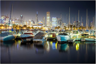
strange in the final. If you look at the three image that I used here,
the middle image has a lot of detail. However, the details in the
shadows are lost in the boats and the city lights are too bright and
lose detail information. The left image is under exposed to pick up the
details in the highlights such as the buildings in the background. The
right hand photo is over exposed by 2 stops to pick up the detail in the
shadows, such as the hulls of the boats and water reflections.
STEP 2
Time to merge the photos together into a single 32 bit image.
Choose File>Automate >Merge to HDR Pro. This works on
Photoshop CS2 - CS6 (CS2 Doesn't have auto align and it's called "Merge
to HDR on versions older than CS5). Choose either images or folder. I
organize each set of photos in its own folder so I used the folder
option. Select your photos to merge. Turn on Auto Align in Photoshop
CS3+. Click OK. (Photoshop uses Auto-align technology that even allows
you to create HDR without the use of a tripod!)
Step 3
Your images will now be merged into a single photo. You can turn
off individual photos by un checking their boxes on the left filmstrip.
If you get some blurring caused by camera shake in the longest exposure,
you may want to turn off that photo. If there is ghosting because of
movement, click the box: Remove Ghosts.
STEP 4
The merged result is a floating-point 32 bit image. Change the
mode to 32 bit. You can view the available tones by sliding the White
Point slider. Note, this slider doesn't change the image, it is there
for you to examine the range of tones, because a monitor is incapable of
displaying all the tonal detail in a 32-bit file all at once.
Step 5
You could do your tonemapping right now if you like, but I like to
save a 32bit negative. Click OK to merge the photos into a 32 bit
image. Now is a good time to save your file. Save as a psd, tif or open
EXR.
If you are working with 3D and are wanting HDRI
for IBL lighting, enviroments etc, save as open EXR as Maya and other 3D
packages recognize this format. (you are finished here, photographers
read on).
Step 6
In order to use the photos, you'll need to convert them to 16 or 8
bit images. When we convert them we will create what I call
interpretations of the photo. The reason I say this is because we have
unlimited ways we can make the photo look. While we have this huge
dynamic range available in 32 bit, we will no longer have those options
after conversion. Always work from the saved 32 bit version, and then
convert and save versions (personal interpretations). Avoid overwriting
the 32 bit image, it's our master and we may want to go back to it many
times.
Choose Image>Mode>16 bit (or 8 bit). Now we get to play with
some fun options. You're now at the tone mapping part of the process.
This is were all the creativity can ooze.
(If you want to make the adjustments without converting, choose
view>32 Bit Preview Options. You can use several of Photoshop's tools
in the Image>Adjustments menu. The most important of these is the
Exposure control)
You'll see an HDR Toning Dialog box (HDR Conversion for versions
before CS5). Exposure and Gamma is the default option. Best way to
approach this? Set the gamma first, then adjust the exposure to suit. If
you want an image with lots of contrast, lower the gamma. For less
contrast raise the gamma. Finally, adjust the exposure to get the
desired brightness. If you want more control, read on... otherwise press
OK to convert.
Step 7
Change the Method to Local Adaption. (There are 4 available methods, but these are the only 2 with user input).
With local Adaption, you get some advanced Tone Mapping sliders
and you can adjust the curves. The use of curves is optional as they
allow you to fine tune the other settings. Set these like you would
normally work in curves, but don't be afraid to clip the histogram a
little. You can clip because you're working with a larger dynamic range
than you're used to. Bring out the detail in the image, but don't forget
to put some shadow in there or it will look washed out and fake.
Edge Glow
Once your happy with the curve, adjust the radius and strength
sliders to make sure there are no halos in the photo. (Badly converted
HDR images have a glow around the areas of contrast.) The radius
controls the mask blur while the strength decides how strong to apply
the effect.
Tone and Detail
Gamma: This is where you control the contrast. Extremes are washed out or super punchy.
Exposure: Controls the overall brightness.
Detail:This sharpens or softens the appearance.
Advanced
Shadow: Opens up details in darkest parts of the photograph.
Highlight: Recovers detail in the brightest areas of the photograph.
Vibrance: This makes the photo more colorful without over saturating areas that are already colorful. (It's smart).
Saturation: Increases or decreases the overall amount of color. Be
careful not to over saturate the colors as a rule. (Of course all rules
can be broken on occasion).
Click ok to convert.
Step 8
Here we have a merged image from HDR. Photoshop is great for producing very realistic HDR images.
Step 9
If your desiring a more surreal result there are different plug-ins that you can use. My favorite is Photomatix pro from HDRsoft. You can just get the tone mapping plug in for Photoshop which works great. Use the coupon code photoshopcafe to save 15%.(code is also good for Photomatix pro)
Using photomatix tone mapping plugin allows you to get highly
detailed textures in your photographs. You merge in Photoshop as shown
in this tutorial. Then choose Filter>Photomatix to apply tone
mapping. Convert and save as normal.
Step 10
This image shows an image after tone mapping using Photomatix pro.
Step 11
Here you can see comparisons between a single image, subtle
Photoshop HDR and a radical Photomatix effect Whatever result your
after, hopefully this tutorial has helped demystify the HDR process.
Step 12
HDR and Lightroom and Camera RAW
A new development in the latest release of Lightroom. 4.2 is the
ability to work with 32 bit images. This is wonderful because you can
use the adjustment brush to fine tune areas of the photograph while
working in a 32 bit enviroment. The image below shows the result of
working with the adjustment brush in Lightroom. Notice how I was able to
craft the image. (The same is possible with ACR). Read on for
instructions...
In order to work with a 32 bit file in Lighroom, you must do the following.
1. Merge to HDR as mentioned earlier in this tutorial.
2. Save as 32 bit file, be careful to save as a TIF, it will only work with a Tiff.
3. Import back into Lightroom, or open in Adobe Camera Raw.
4. Use the adjustments as you would normally, but enjoy a lot more control and larger range of tones than before.
INTRODUCTION
This is a look that I have been using in one way or
another for a number of years. I have noticed that it's becoming more
popular lately on webpages and movie posters. I decided to write it up
into a tutorial for your enjoyment!
The Trendy Colorizing Effect :
Step 1
This is an effect that I have seen used in different ways.
It seems to have evolved into a low contrast version, which I have seen
on movie posters etc. So I figured, why not make a tutorial on it and
show you my way of making this effect. I don't really have a name for
it, so I heareby dub it the: Low Contrast Fashion Color effect.
To get started begin with a photograph, it works best on photos of people, but works on anything.
Step 2
First of all, for better results, reduce the contrast. The
best way is to use an adjustment layer. Create a levels adjustment. (You
could use Levels Cmd/Ctrl+L if you prefer)
In levels, Push the midrange to the left, by moving the middle gray triangle.
Step 3
Add a gradient fill adjustment layer. This is available as an adjustment Layer. Choose the Gradient Fill option.
Choose the rainbow colored gradient option by clicking on the gradient preview and choosing it from the gradients that appear.
Step 4
Change the angle and size to you’re your tastes. Diagonal
and larger work well, as it reduces the amount of colors splashed across
the photograph and improves the effect.
Step 5
With the gradient layer selected, change to color blend mode
at the top of the layer panel, where it says "normal". This will allow
only the color to pass through to the photograph and preserving its
deatails.
Step 6
The result should look something like this. If it
doesn't, you can always change the gradient by double clicking the
gradient thumbnail in the Layers panel. This will open up the dialog box
again (why Adjustment Layers are so good). Here is a tip: You can
actually drag the gradient on the document to change it's position.
(When the Gradient Fill Adjustment Layer Options are open.)
INTRODUCTION
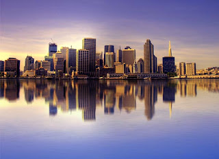
In this tutorial we will learn how to create a realistic water reflection effect using the power of Photoshop.
Here you can see the preview of the final result
Step 1
______________________________________________________________________
The very first thing you have to do is to open the image you want to
modify in Photoshop. Then go to “Image”, click on “Canvas Size” and
double the “Height”. Make sure you choose the top as the anchor point.
(Note: You can also use the crop tool and crop the image larger than the canvas size)
Thus, we have created the space for the reflection
 Step 2
----------------------------------------
In this step we’ll start creating the reflection. So, duplicate the
previous layer (CMD/Ctrl+J) and call it “Reflection”. Then go to
“Edit>Transform>flip Horizontal”
Step 3
------------------------------------------------------
Now, we’ll create some blur. Filter>Blur>Motion Blur. Set the angle to 90° and the distance to 30 pixels.
Step 4
-----------------------------------------------------------
Select the “Smudge Tool” and set the size of the brush to 150 pixels,
the hardness at 0 and the strength to 20%. Use this tool to create
some irregularity typical of a water surface.
I suggest you experiment with settings to get the result you like most.
Step 5
-----------------------------------------------------
It’s time to create the water ripples.
Now, create a new layer, fill it with White. Go to Filter>Noise>Add Noise.
Amount 400%, set the “distribution” to Gaussian and check “Monocromatic”.
Step 6
------------------------------------------
Go to Filter>Blur>Motion Blur. Set the angle to 0 degrees and the distance to 40 pixels.
Now we’ll modify the contrast. So click Ctrl + L and use the following values:
Input Black: 147
Midtones: 1,53
Input White: 219
Step 7
-----------------------------------------
To make the ripples seem more real, we’ll work on the perspective.
So, go to “Edit”, “Transform” and click on “Perspective”. Simply go
to a bottom corner (left or right) and drag the corner out. Do the same
with a top corner but drag it in.
You should get this result.
Step 8
------------------------------------
Go to “Filter”, “Blur” and Gaussian “Blur”: set the Radius to 3 pixels.
Now set the layer opacity to 30% and the blend mode to Soft Light.
Step 9
--------------------------------------------
Duplicate the previous layer.
Press Ctrl + I (to invert the colors) and set the blend mode of the level to Overlay, the opacity to 25%.
Remember to put these two layers between the layer with the original picture and the one called “Reflection”.
Final
Once again I invite you to make your own changes and experiments to get the best-looking result you can
|


