


As I struggled to think of a design for the contest, I took some time to clear my head by watching some TV. It turns out that The Matrix was on, and was right at the scene in the subway as they used the pay phone to escape. And an idea was formed. Why not make a phone, a phone?
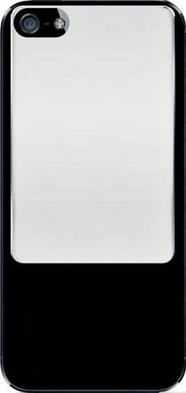
Step 1
I started out with the supplied template and began to slowly build my phone using mostly shape tools and layer styles. All of this was created using Photoshop CS4 and a Wacom Intuos3. No external images or programs were used.
I laid out a few rounded rectangles and used a chrome layer style as a starting point for to get the raised metal look and would adjust each slightly to create the exact look I wanted.
Again, using more shape tools (circle, rectangle, rounded rectangle)
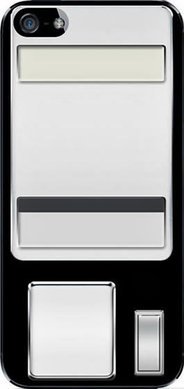
Step 2
I created the coin slot and coin return lever adding an inner shadow to the coin slot, and adjusting the chrome layer style for the lever and the same for the phone cradle and buttons. I decided not to do all of the buttons just yet because I knew the handset would be covering a majority of them. As I look back, the one thing that bothered me is that I took the first column of buttons and just duplicated them without changing them at all. Even though you can’t see it in the final product, I know it’s there. Since the time that I submitted it, my slight OCD kicked in and I altered them so they weren’t an exact copy.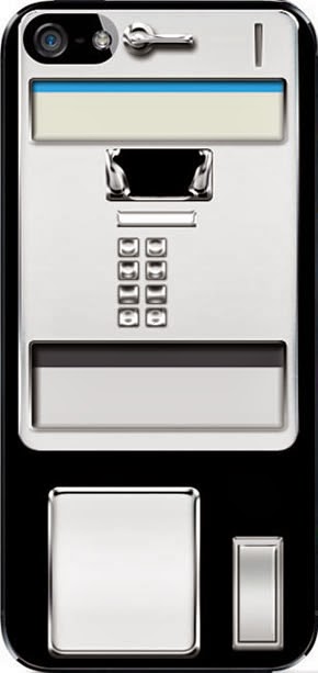
Step 3
To create the handset I began with a rounded rectangle with a large curve, adding a drop shadow, bevel/emboss, gradient and pattern overlays and stroke to get the effect of the phone hanging off of the cradle. The pattern overlay was used to add a bit of texture as if it had been used for quite a while. I then added two circle shapes and finished them off using a similar layer style to the handle, while also using the burn and dodge tools to add some additional shadow and highlights.
Since the handset is above a reflective surface, I made sure to duplicate and transform it and added a slight blur and masked it out to fade the reflection.

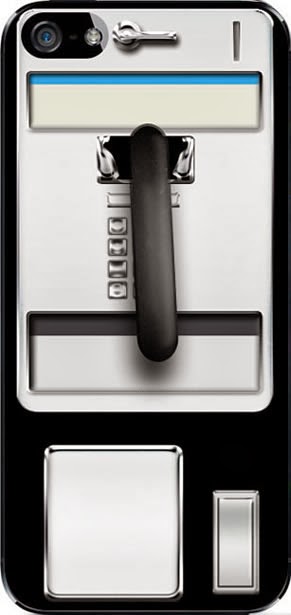
Step 4
I then moved onto what I thought was going to be the tough part of the phone, finding a way to make the cord look like braided metal. I spent some time trying different tools to get the look I wanted, the best result came from using the pen tool to create a path where I wanted the cord to fall. From there, I used the concentric circle brush with the spacing set to around 20%, and the shape dynamics set to a 0 Size Jitter, and 100% Maximum Diameter with all other options off to stroke the path.

Step 5
The actual cord is made up of 6 layers set to overlay, and screen with inner shadows to help finish off the effect. Again, with the cord on a reflective surface, don’t forget to add the slight reflection with the opacity turned down to 50% and set to Hard Light. The blue rubber was then added to connect it to the phone using shapes and the burn/dodge tool to give it a rounded grungy look.At this point the phone was ready for the text to go on. I took a look at a few phones to see what information was included to be sure I had an accurate look. With the blocks of text below the buttons, I used a Lorem Ipsum filler text because I knew that the text would not be readable at the size it was set at, though as with the buttons, I’ve since gone back and added text that would be included because it didn’t feel right having “filler text” on it. As an added touch, I added a US map that I found on Adobe Exchange, and added the Adobe logo.
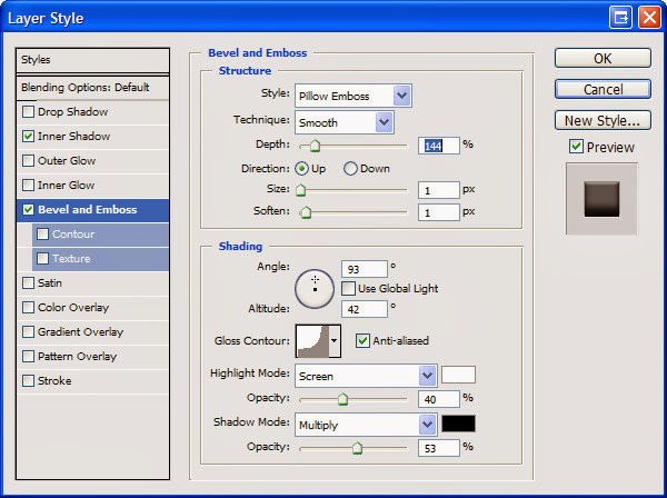
For the embossed text on the metal areas, a slight inner shadow, and pillow emboss with a depth of 144 was used.

Step 4
I then went through and added a few minor touches including a couple of advertisement “stickers”, the lock box key slot and outlines around the information text.I was happy with it at this point, but felt it was a bit too clean looking and needed some grime as if it had been used for years. I took a cloud brush with a brownish color and set it to a Size Jitter of 100%, Angle Jitter of 100%, and Scattering to 300% all with Pen Pressure set as the control. I then began to randomly brush over the entire phone and lowered the opacity and added a layer mask to soften areas to a point where I felt it was just enough.
As with most designs, I had a lot of trial and error to get to the final product; trying out various brushes, effects, shapes, colors, fonts, etc., and of course there are a dozen different ways to get the same effect, so go with what works for you. Personally, I am happy with the result and glad to find my first second place win!
